Responsive Design
Responsive design is a method of using media queries in Cascading Style Sheets (CSS) to ensure a site is usable on various devices with different screen sizes, from very small to very large.
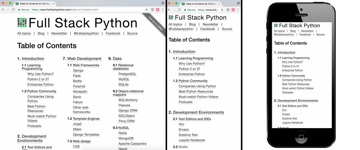
Full Stack Python uses responsive design to improve readability across a broad range of devices that people use to read this site.
Responsive design resources
-
The Responsive Design podcast and accompanying email newsletter interview web designers who've dealt with creating responsive designs from both a blank slate and retrofitting into an existing site.
-
This site is entirely on responsive design and has many articles on how to achieve readability across devices.
-
Using Media Queries For Responsive Design In 2018 contains a bunch of great examples for how to use media queries to achieve a responsive design.
-
Making Tables Responsive With Minimal CSS steps through a couple of ways to responsively handle tables.
-
Smashing Magazine's article from 2011 on responsive design - what it is and how to use it remains a definitive source for understanding why sites should be responsive.
-
Fundamentals of responsive images shows the code behind several ways to make your web images resize according to browser window size.
-
ResponsiveViewer is a Chrome plugin in that allows you to view multiple sizes and devices in the same browser window. This is a handy tool to avoid constantly flipping between tabs or resizing the same tab to see the changes you are making to a design.